
When you are designing a product to provide self-service:
- You can’t pre-determine the physical attributes of the user; and
- You don’t have an opportunity to train the user
People wanting to access the services will come in a range of sizes and abilities and will need to intuitively understand how the device works first time.
Interactive touchscreen kiosks are squarely in this category, being designed for interaction with humans, allowing us to input and receive information in a range of formats, and generally in a public environment.
The users may never have accessed a kiosk before, they may have physical disabilities or impairments, and they may be using the equipment under a whole range of light, noise and weather conditions.
The analysis and understanding of these access variants is called Anthropometrics, and understanding the principles is crucial to designing kiosks with universal accessibility.
Good anthropometric design ensures a good fit between the user, the equipment and the environment. In the case of a kiosk, which will be used by a wide range of people, it is concerned with designing the best fit for the widest range of users. Cognitive ergonomics is concerned with mental processes and is used in the design of information.
Henry Dreyfuss, who was a 20th century industrial designer, greatly advanced the understanding of, and standards for, good ergonomic design. The Dreyfuss anthropometric standards are still extensively used, and are one of the foundations on which Neo designs its products.
There is also an ISO standard (9241) for ergonomics, including tactile and haptic responses. These standards must be addressed, but the Dreyfuss principles are widely accepted as being more personalised, simplified, visual and graspable.
The Dreyfuss approach to ergonomic design is about having a point of reference. It offers a set of design guidelines rather than rules. Kiosks are designed for general purpose access and Dreyfuss’ anthropometric guides help us to address the extremities of parameters such as likely maximum and minimum user heights, in order to set appropriate mid-points.

Considerations for disabilities and impairments also form part of the guidelines. The universally acknowledged symbol for disability in terms of someone accessing a kiosk is a user in a wheelchair, and whilst wheelchair users are certainly an important group of users to consider, they are in fact only one of 34 categories of disability.

Once these parameters are understood, specific design points can be engineered, including:
- Screen angling – aiming for maximum visibility for the majority of people, within the confines of the ambient lighting in the kiosk environment.
- Positioning of speakers – for maximum audibility for the majority of users, taking into consideration the ambient noise of the kiosk environment.
- Printers can be positioned to provide output close to the user’s hand, so they can easily see a print out and don’t have to bend or reach up or down.
- The positioning of input devices such as keyboards, barcode scanners and card readers can be planned for maximum efficiency and most intuitive and comfortable use. Considerations include the distance between the keyboard and the front of the shelf, and its angle and, whether it is the monitor or the keyboard that moves to make adjustments. A mean resting height should also be determined – which is the height to which the screen/keyboard resets after a certain period without use.
- If keyboards are to be adjustable to allow for wheelchair users, consideration must be given to the raising and lowering mechanism. Users with no feeling in their legs may risk crushing with mechanised movement, and sensors can be considered.
- Where a kiosk includes a printer, and paper is to be changed by staff, the printer positioning and each of access for paper refill is important. A paper roll can weigh up to 15kg and reaching in to a machine with one carries a risk of musculoskeletal injury.
- User buttons (whether physical or on the screen) whose size, design and positioning are developed along ergonomic principles will be easier to use. Grouping of items on the screen is a design factor, as is colour and contrast, especially for users with visual impairment. Even without impairment, there are some situations where users are likely to be less than 100% alert, such as when using the Smartgate passport reader at Australia’s international airports. Users have come straight from flights of up to 24 hours, and want to get through the kiosk quickly. The design took this into account, with clear instructions, light paths and images to simplify what was for many a new process and make it as intuitive as possible.
- Haptic responses communicate with the user through the sense of touch, and include vibration (for example on mobile phone buttons) and force feedback (on data gloves and joysticks used in computer games and simulations). Good ergonomic design will use haptic, or tactile, responses where it is appropriate and enhances usability. Keyboards and pin pads too should give enough tactile feedback for the user to know that their input has been received.
Good ergonomic design makes all the difference between the success or otherwise of a kiosk. Neo uses Dreyfuss principles to design and test every kiosk produced, calling on its huge body of knowledge and experience to ensure that its kiosks are designed for maximum usability by the maximum range of users.


The Dreyfuss Principles
Anthropometrics
noun
- (the measurement of the size and proportions of the human body), especially as it relates to the design of furniture and machinery.
The contribution and influence of Henry Dreyfuss, on the way that products are designed to work with the human body, is considerable.
He was born in Brooklyn USA in 1904, and in the 1930’s was already one of the world’s most influential industrial designers, dramatically improving the look, feel and usability of many products. Products as diverse as telephones, vacuum cleaners, tractors and locomotives. Even the Polaroid camera was made considerably more user friendly through his design expertise.
While a number of his industrial design contemporaries, such as Raymond Loewy, were industrial “stylists”, Dreyfuss was one of the key architects of the concept of “form follows function”. This approach saw designs start with the “problem” and the form of the product grew from “solving the problem”.
As an example, the tabletop telephones that Dreyfuss designed for Bell and Western Electric became standards, being used in hundreds of thousands of households from the 1930’s through into the 1960s.
John Wiley & Sons, Inc.
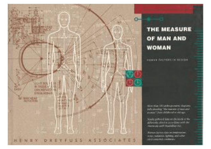
Later in his career, Dreyfuss started to compile and publish several works relating to his extensive design experience. In 1955, he wrote Designing for People. The book defined his ethical and aesthetic principles. It included many anthropometric charts. In 1960 he published The Measure of Man and Woman, a further collection of ergonomic reference charts which became standards for designers through providing precise specifications for product designs.
These design principles are as valid today as they were when Henry Dreyfuss published them 60 years ago.